Interactive Map
How To Use
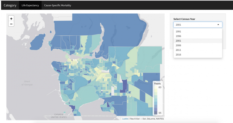
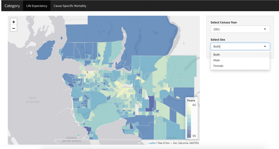
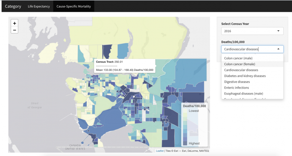
The purpose of this interactive map is to help you compare and provide a spatial representation of the average life expectancy at birth and cause-specific mortality rates of Metro Vancouver residents at the census tract level.
Step 1: Data is organized into two major categories: LIFE EXPECTANCY and CAUSE-SPECIFIC MORTALITY. Use the menu at the top to select the category of interest.
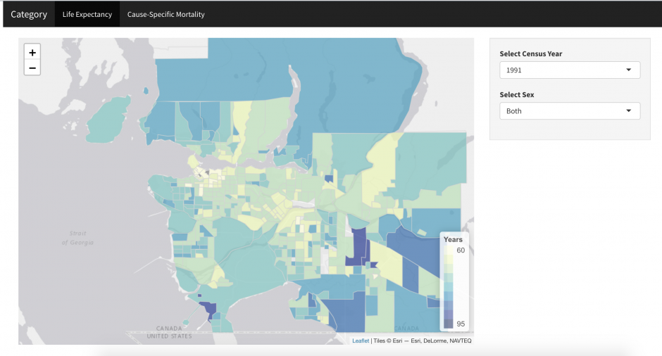
Step 2: Use the first drop-down menu to select the year of interest.
Step 3: LIFE EXPECTANCY data is organized by sex. Use the drop-down menu to change your selection.
CAUSE-SPECIFIC MORTALITY data is organized by disease types. Use the drop-down boxes to change your selection. Use the drop0down menu to change your selection to the cause of interest.
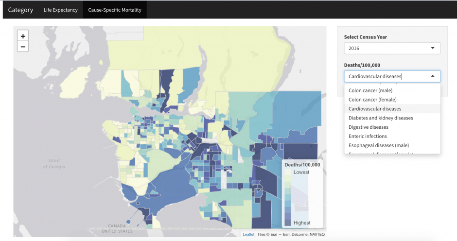
By hovering over the map, you can see either the average life expectancy or death/100,000 for each census tract depending on the category of interest currently selected.
All data files used in the generation of these maps can be downloaded here. Note that all use of these data should cite:
Yu J, Dwyer-Lindgren L, Bennett J, Ezzati M, Gustafson P, Tran M, Brauer M. A spatiotemporal analysis of inequalities in life expectancy and 20 causes of mortality in sub-neighbourhoods of Metro Vancouver, British Columbia, Canada, 1990–2016. Health and Place In press.